💡What You'll Learn
- Why building for investors leads to product bloat
- How the “demo effect” kills real user adoption
- Why retention matters more than impressing a pitch deck
- How to apply the five-second clarity test
- Why user obsession attracts investors naturally
I once sat in a product meeting where someone said:
“We need to add that feature. Investors will love it.”
No one asked if users needed it.
No one asked if it solved anything.
No one asked if it made the product better.
But it looked impressive in a pitch deck.
And that’s how it starts.
The Silent Shift That Kills Products
Most startups don’t wake up and decide to ignore users.
It happens slowly.
First, you build something simple.
You talk to users.
You tweak things based on feedback.
It feels honest.
Then funding conversations begin.
Suddenly the language changes:
- “What’s your defensibility?”
- “Where’s the AI?”
- “Can this scale 10x?”
- “What’s the moat?”
- “How big is the TAM?”
All valid questions.
But here’s the trap:
You start designing answers for investors instead of solutions for users.
And that shift is subtle — but deadly.
The Demo Effect
There’s something called the “demo effect.”
It’s when a product is built to impress in a 20-minute presentation instead of survive daily use.
You’ve seen it:
- Beautiful dashboards nobody understands
- Features stacked on features
- AI labels slapped onto basic automation
- Complex onboarding flows that scream “enterprise-ready”
It looks powerful.
Until a real user logs in.
Then the confusion begins.
Investors See Potential Users Feel Friction
Investors evaluate:
- Market size
- Scalability
- Revenue projections
- Competitive advantage
Users evaluate something much simpler:
“Does this help me?”
That’s it.
They don’t care about your burn rate.
They don’t care about your valuation.
They don’t care about your Series A narrative.
They care about:
- Speed
- Clarity
- Simplicity
- Results
And when those things aren’t there, they leave quietly.
No feedback.
No drama.
Just churn.
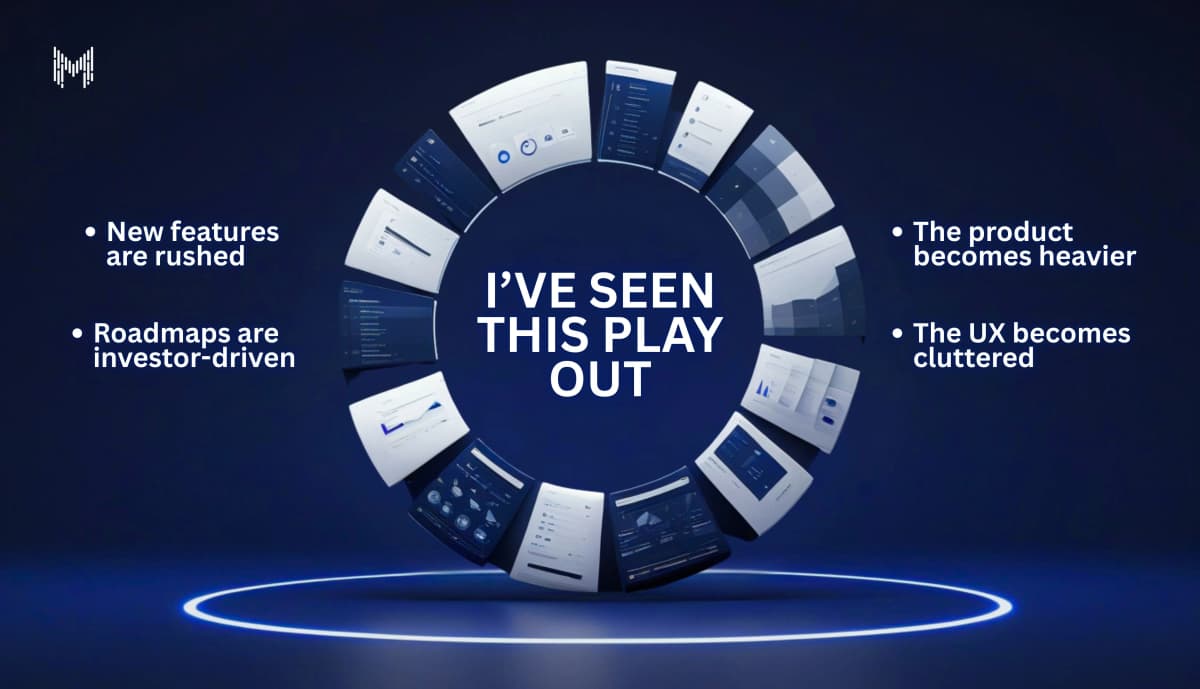
I’ve Seen This Play Out
A startup builds a clean, focused MVP.
Early users love it.
Then funding comes in.
Suddenly:
- New features are rushed
- Roadmaps are investor-driven
- The product becomes heavier
- The UX becomes cluttered
The original users?
They start saying things like:
“It used to be simpler.”
That sentence should terrify every founder.
The Pressure Is Real (And Understandable)
Let’s be fair.
Founders aren’t villains.
When you raise capital, expectations change.
You feel pressure to:
- Show rapid growth
- Expand features
- Enter new markets
- “Look bigger” than you are
So you add.
And add.
And add.
Because growth feels like addition.
But clarity often requires subtraction.
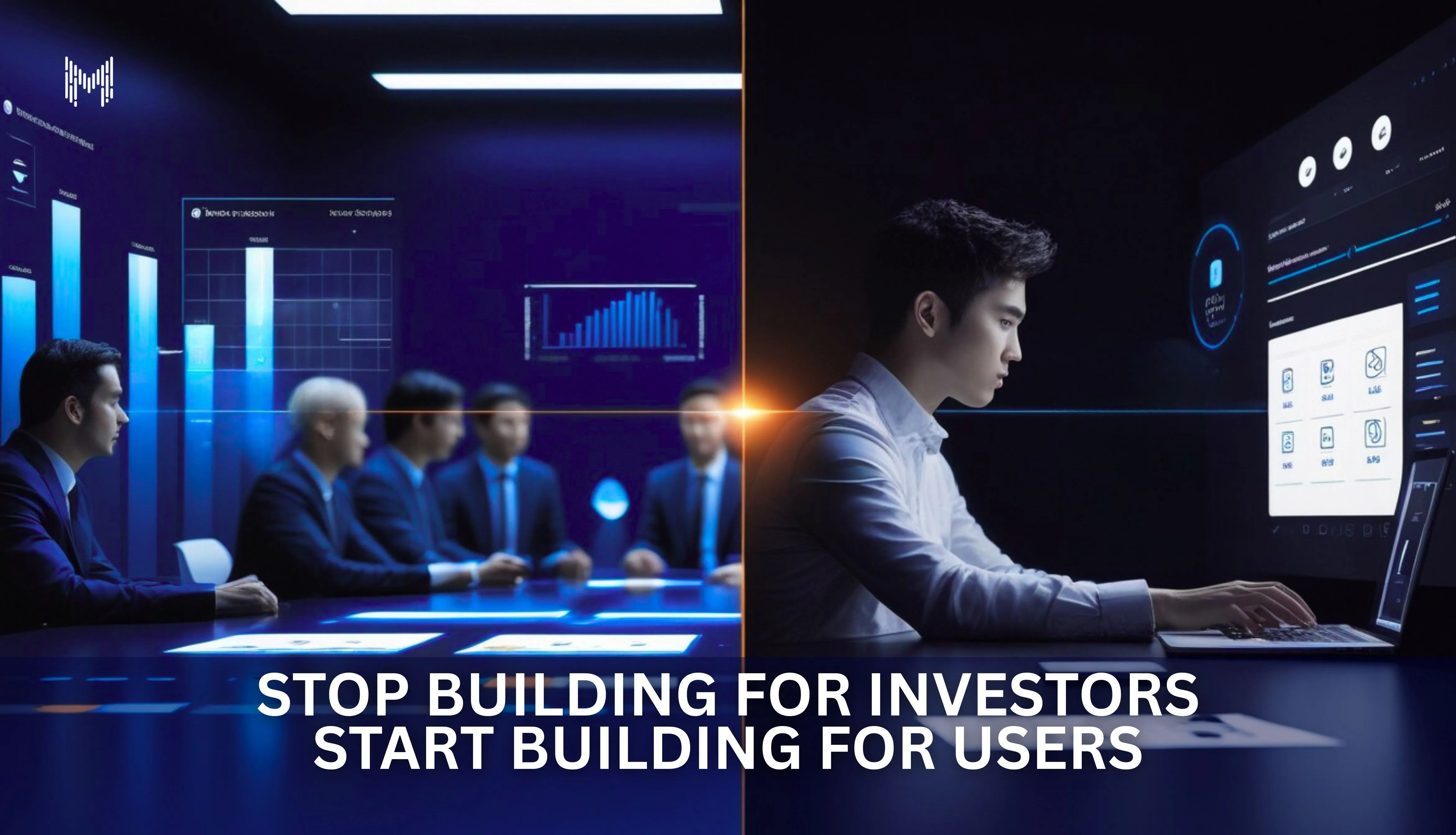
The Hard Truth: Investors Follow Users
Here’s the irony.
The companies that obsess over users?
They attract investors naturally.
The companies that obsess over investors?
They struggle to retain users.
Look at products that dominate their category.
They didn’t win because their pitch deck was perfect.
They won because:
- The product made sense instantly
- It solved a real problem
- It respected users’ time
Investors showed up later.
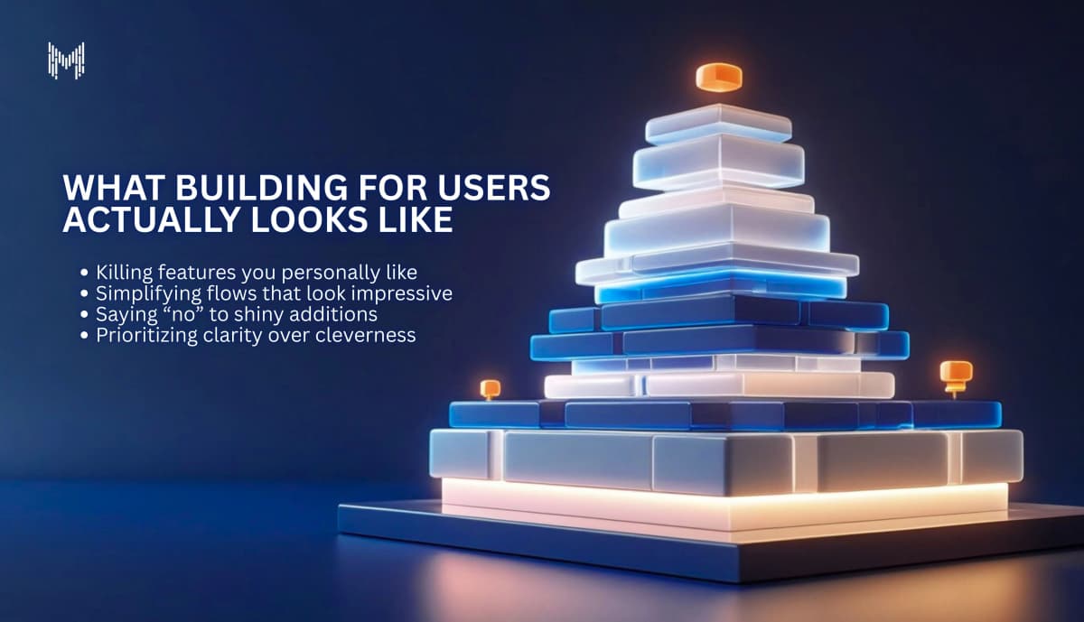
What Building for Users Actually Looks Like
It’s less glamorous than you think.
It means:
- Killing features you personally like
- Simplifying flows that look impressive
- Saying “no” to shiny additions
- Prioritizing clarity over cleverness
It means asking:
“If this disappeared tomorrow, would users miss it?”
If the answer is no remove it.
Users reward simplicity.
Investors reward traction.
Traction comes from users.
The Ego Problem
There’s another layer no one talks about.
Building for investors feels good.
It makes you feel strategic. Visionary. Big.
Building for users feels… smaller.
You’re solving micro problems. Tweaking buttons. Reducing friction.
But those “small” details are what create momentum.
Ego builds complexity.
Empathy builds loyalty.
The Five-Second Test
Open your product right now.
Imagine someone new lands on it.
In five seconds, can they answer:
- What is this?
- Is it for me?
- What do I do next?
If not, you’re building for explanation.
Not for users.
And explanation doesn’t scale.
The Cost of Getting This Wrong
When you build for investors first:
- User churn increases
- Support tickets rise
- Onboarding becomes longer
- Marketing has to work harder
- Trust erodes
You end up patching problems instead of solving them.
And eventually, the numbers investors care about start slipping.
Because users were never truly convinced.
The Companies That Win
The products that last aren’t the most complex.
They’re the most obvious.
They feel natural.
They feel intuitive.
They feel like they were built by someone who actually understood the problem.
Not someone trying to impress a boardroom.
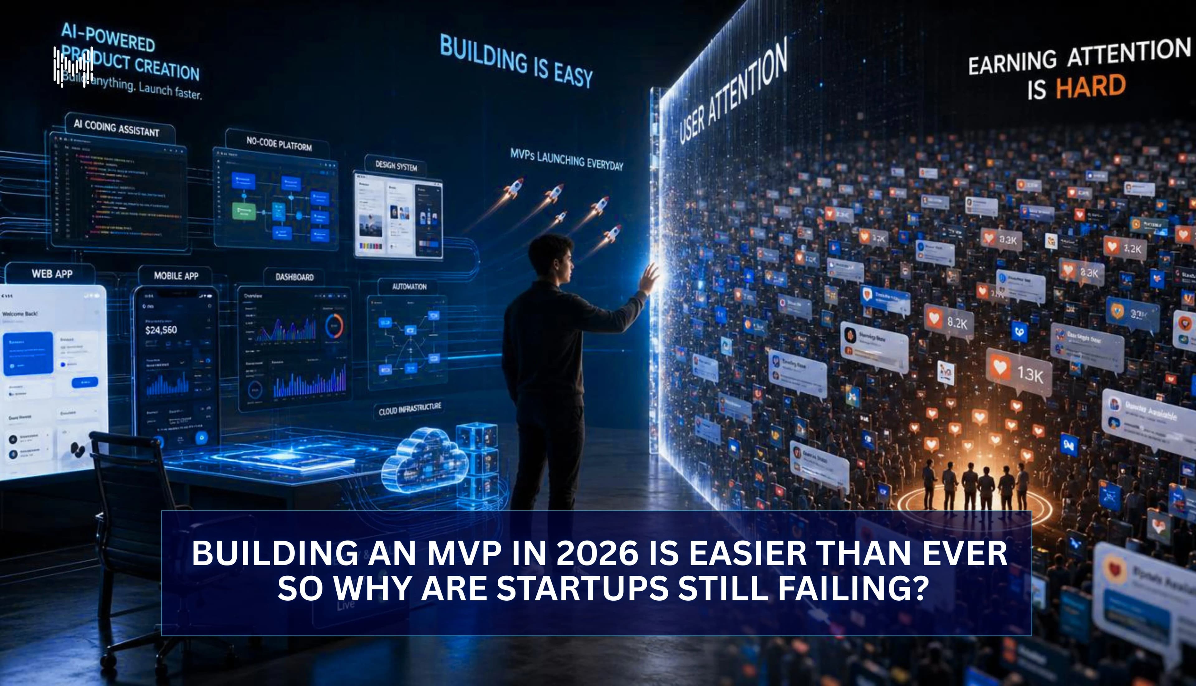
Why This Matters More in 2026
In today’s market:
- AI makes building easier
- No-code tools reduce barriers
- Features are cheap
Everyone can build.
Very few can simplify.
In the next cycle, the winners won’t be the startups with the most impressive decks.
They’ll be the ones with:
- The lowest friction
- The highest retention
- The clearest value proposition
And those things don’t come from investor-first thinking.
They come from user obsession.
Why Choose MKaits Technologies
At MKaits, we don’t build products to look impressive in a funding meeting.
We build products that:
- Make sense in five seconds
- Reduce cognitive load
- Remove unnecessary friction
- Convert because they’re clear
We believe:
- Simplicity scales
- Clarity converts
- Retention beats hype
Because investors don’t fund features.
They fund traction.
And traction comes from users.
If you’re building right now, pause for a second.
Ask yourself honestly:
Are you building something people will love using?
Or something someone will love investing in?
One creates loyal users.
The other creates pressure.
And only one of them survives long term